Portrait session & project release: Barry Uhl

This one is more than just a photoshoot and a website update. This is the endcap to something a year-and-a-half in the making that's included endless journaling and listening, long walks around the neighborhood, apprehensions, celebrations, and... well, a photoshoot and a website update. :) I'm speaking here, of course, about the release of Barry's second record, The Stargazer's Bible. If you're wondering who Barry is, in addition to being my main squeeze, he's Barry Uhl -- an insanely talented composer, writer, illustrator, and all-around amazing creative. (And yes, I had all those same opinions before we started dating.) 

From a project perspective, much of the technical work I've done here -- in addition to the portraits above that we shot last week -- took place in the internet realm: I completely revamped and overhauled the last website I made for him, transitioning from Wordpress over to Squarespace for a more modern, flexible design layout. I also generated some written content, and then worked to sync text and images across smaller related platforms (Bandcamp, CDBaby and the like) for a cohesive online presence. Later this week, we'll be assembling the onesheet with physical CDs to send out in a small mailer to press and labels.

We worked together on his last album as well, and I can say hands-down that this multi-hat creative engagement with artists -- with this artist, specifically -- is my most favorite, as well as the most rewarding, work I've done in quite some time. Barry has worked his tail off on this record, doing everything from the demos to the final mastering in-house (and by 'in-house' I mean 'in our shared home office'). To say I'm proud of this guy would be an understatement -- more accurately, to be by his side through this process AND to be able to make a creative contribution to it's birth out into the world has been an incredible experience. I can't wait to see what happens next!


Freshly launched: two websites (and one redesign!)

March, already almost past, was my busiest web design month yet -- two new sites, and a redesign of a site I built last year. I'm really pleased with how they turned out, and the clients are thrilled as well!

asbeditorial.png

The first site I finished this month, and hands-down the prettiest one I've made yet that wasn't for a personal project of my own, was a content-rich informational site for editor Amy Smith Bell. Amy had an old site with LOTS of great content, but framed in an outdated design. I took all of her (impressive! genre-crossing!) work, broke it down into categories that were easier to digest, and gave her a clean, cool, modern design that matched the quality and caliber of her work.

The site still links through Wordpress address at the moment, but Amy will be transitioning over to her direct link in the coming weeks.

redthreadadv.png

Second spot on the dance card this month was Rachel Cardone's Red Thread Advisors website. Rachel came my way via a Seattle women's business-related Google group recommendation, and similar to my interactions with Amy, I found myself floored by the depth and scope of her work. Rachel has worked on impressive projects, consulted for the Gates Foundation, and is an all-around quality human being to boot. We pulled the content from her outdated hand-built site, delivered key information in a bold, clean, easy-to-understand design, and let her work speak for itself.

I've handed the reins over to Rachel for some final content edits, and will link back to her completed site here soon!

Last up, but certainly not least, was a quick redesign for a site I built last winter. I worked with my now-partner Barry Uhl on the launch of his project in 2014, and took some time this month to give him a basic refresh. We're prepping to map all new content for his site in order to focus on the release of his next album, The Stargazer's Bible, and I wanted a clean slate to work with in the meantime. Once we've got graphics and visual / audio assets, I'll be digging back in to both design and written content to reflect all the incredible work he's done.

If you're in need of a new site, or a redesign of something you've already set up on the web, please don't hesitate to get in touch. My rates are very reasonable, and I'd love to lend a hand on your project!

Product shoot and web design: Laura Stalions

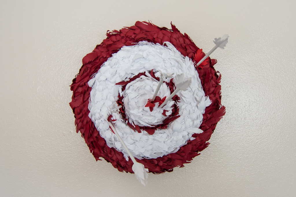
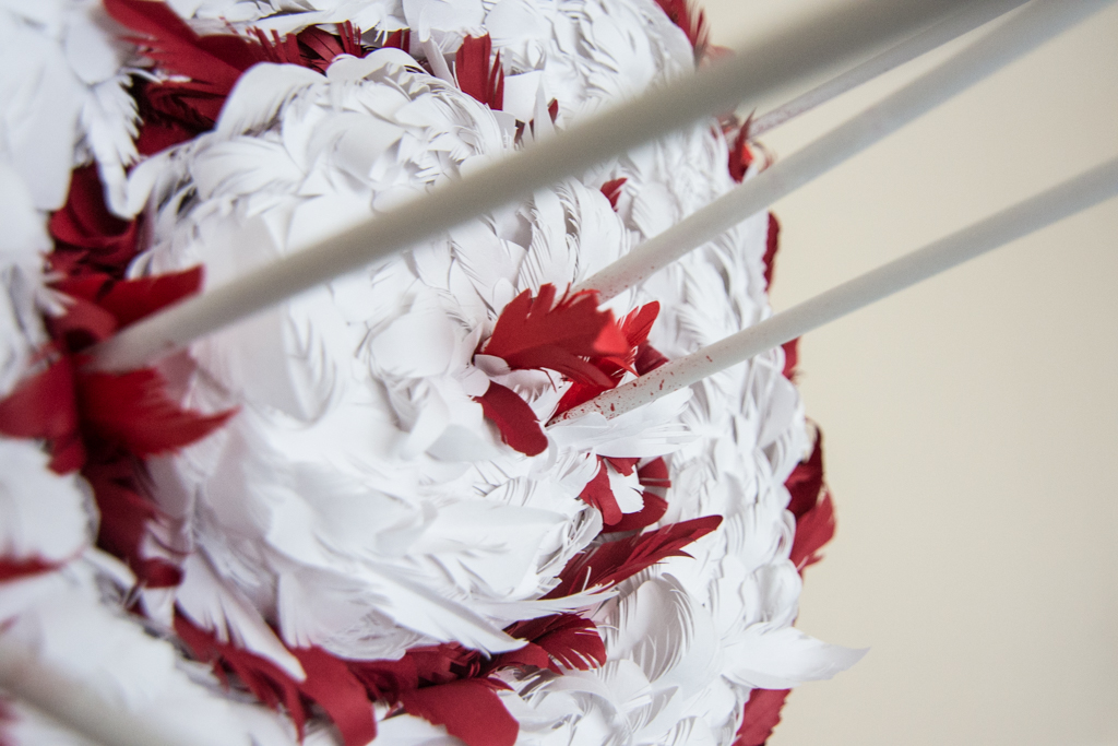
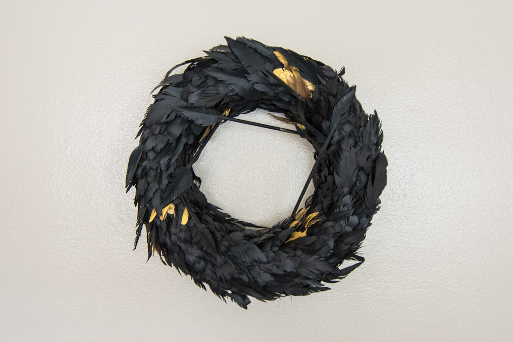
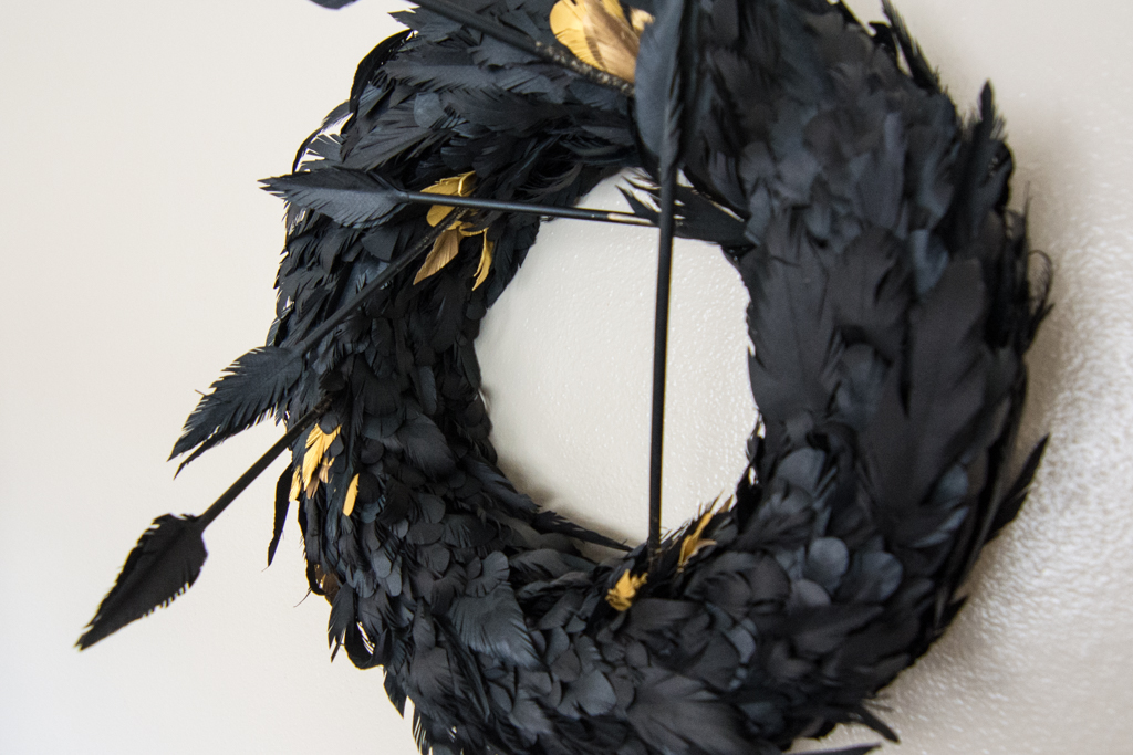
This month's project was a bit multi-faceted: I worked with mixed-media artist Laura Stalions to build a basic online gallery that showcased the pieces she wanted to list for sale, and also did a photoshoot for the actual pieces as well. One afternoon of shooting, a few days of Wordpress immersion, and a handful of basic edits later, I launched her site.

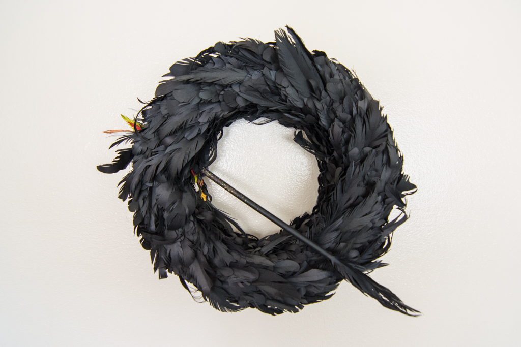
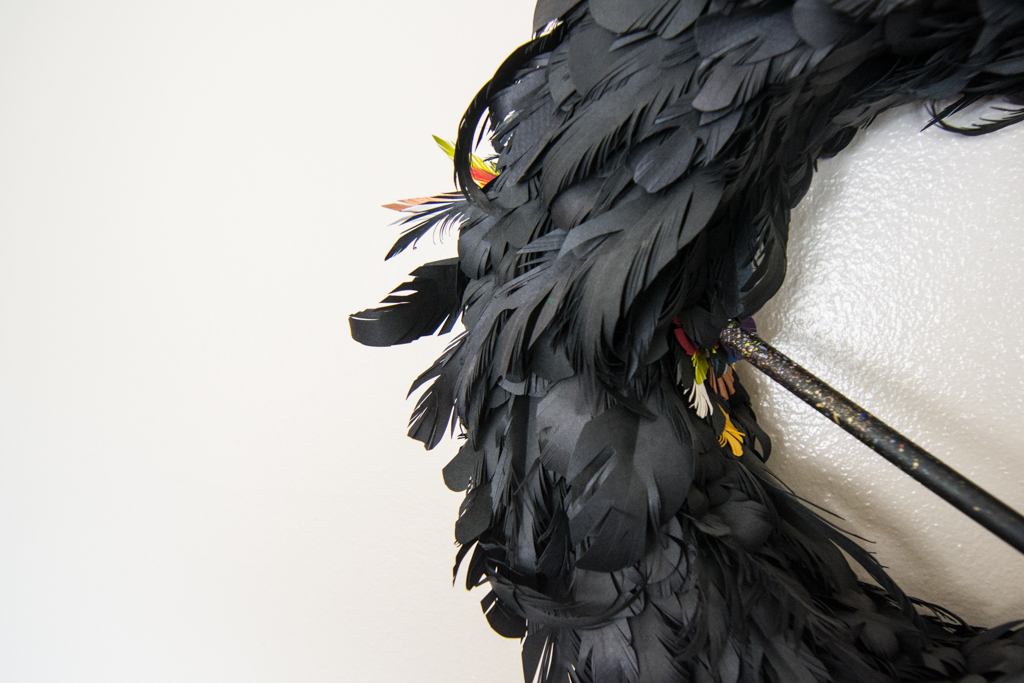
The shoot involved a visit to Laura's home studio, to capture accurate renderings of high-gloss paintings (without the pesky glare), straight-on images of her screenprints, and my personal favorite, these hand-forged wreaths:

In addition to the work displayed, she also does commissions and custom jobs -- don't hesitate to reach out to her if you have something in mind!